

In today’s data-driven world, clear and actionable visualisations are essential for informed decision-making. Among the most powerful analytical tools are quadrant charts—graphs that categorise and evaluate entities based on two key metrics. These visuals help businesses instantly understand where their assets, products, or partners stand across dimensions like performance and potential.
Until recently, creating quadrant charts in Power BI required creative workarounds involving complex layering or third-party visuals. Thanks to recent updates, Power BI now fully supports native, dynamic quadrant charts.
These new charts bring together intuitive interactivity, vivid colour coding, and flexible customisation without the need for external add-ons.
Building Your Native Quadrant Charts in Power BI
Step 1: Start with a Scatter Plot
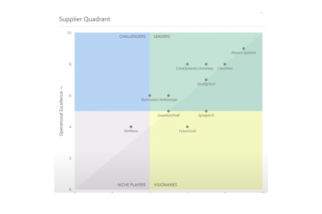
Begin by plotting your entities on a scatter chart using two relevant metrics. For example, vendors could be visually evaluated on:
- X-axis: Market Foresight — How well does the vendor predict and adapt to market changes?
- Y-axis: Operational Excellence — How efficient and reliable are the vendor’s operations?
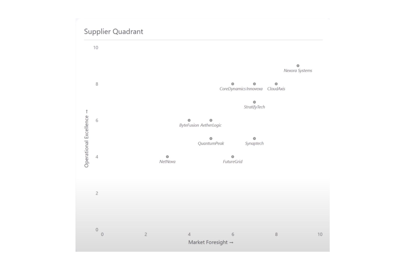
A scatter plot alone gives a distribution overview but lacks immediate interpretability about performance segments.
Step 2: Define Quadrants with Reference Lines
Use Power BI’s powerful reference line feature to divide your scatter plot:
- Add vertical and horizontal constant lines at midpoints or other meaningful thresholds on both axes.
- Apply shaded regions on either side of these lines in contrasting colours.
- The overlapping shaded areas form four visually distinct quadrants, easily separable by colour.
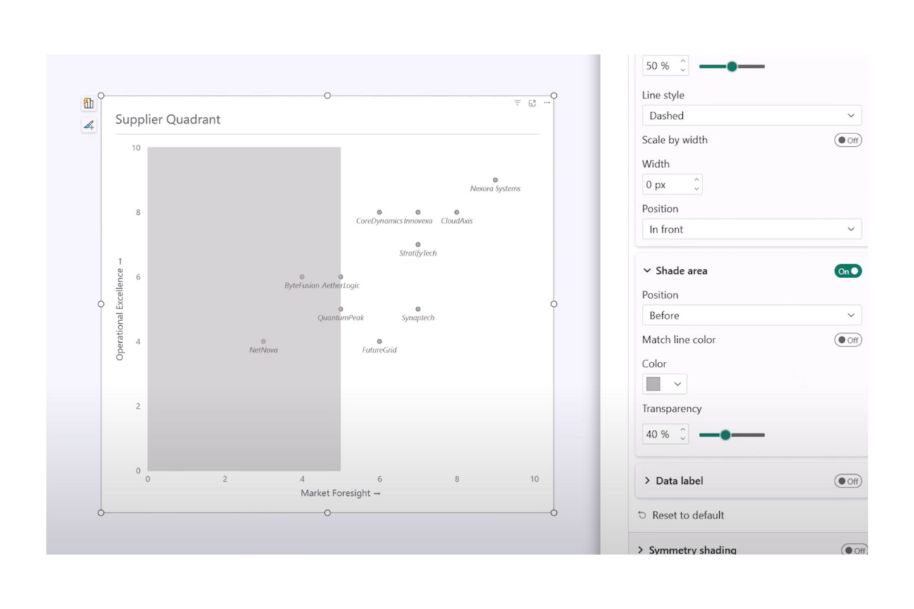
This native feature allows a clean division of your data space, breaking your entities into groups based on the intersection of the two metrics.
Step 3: Customise the Visual Style
Enhance readability by refining your markers and shading:
- Adjust marker transparency so overlapping points are visible.
- Set marker shapes and sizes to improve differentiation.
- Fine-tune shading opacity to about 75% for balanced colour blending.
Power BI’s flexibility lets you tailor your chart’s aesthetics to your brand or reporting style.
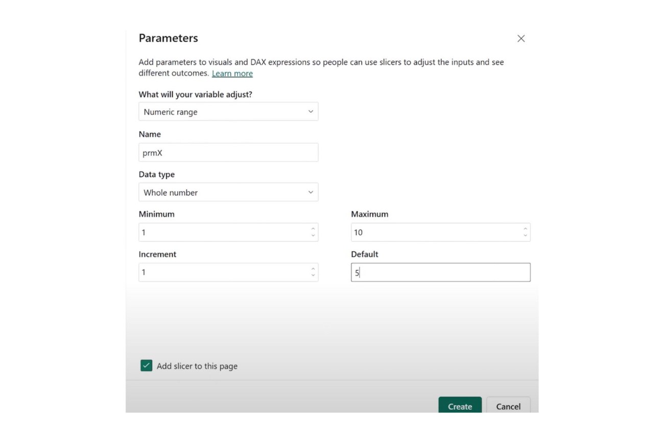
Step 4: Enable Dynamic Quadrants Using Parameters
One of the most exciting new capabilities is dynamic boundary adjustment:
- Create numeric parameters representing quadrant thresholds.
- Bind these parameters to the reference lines’ constant values.
- Add slicers for users to interactively move quadrant boundaries.
This interactivity empowers stakeholders to explore different categorisation scenarios, uncovering new insights.
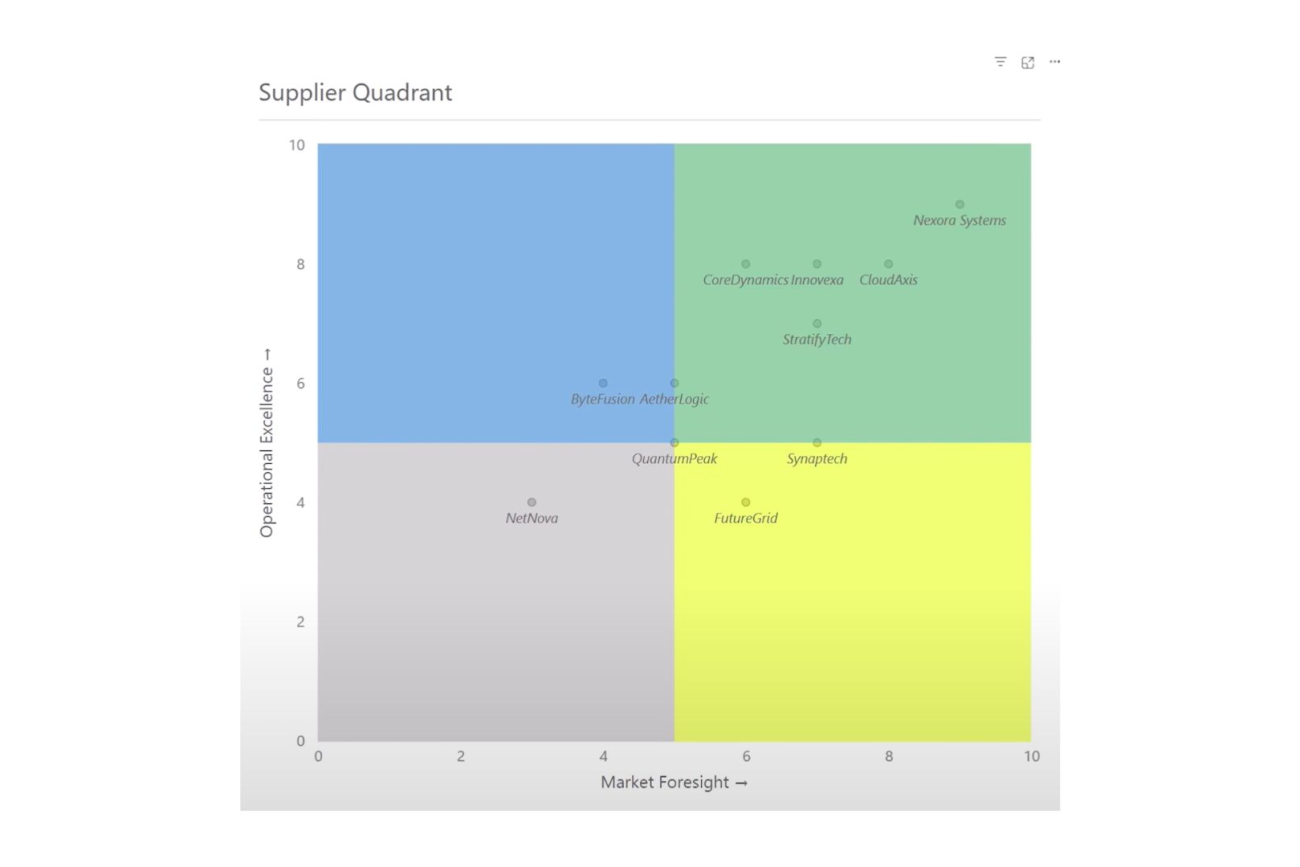
Step 5: Label Your Quadrants for Clarity
Power BI lets you add descriptive labels for each quadrant like “Leaders,” “Challengers,” or “Niche Players”. Use line labels or dummy lines to position these without cluttering the visual.
Clear quadrant labels make your report instantly understandable to decision makers.
Step 6: Add Symmetry Shading for Contextual Nuance
Go a step further by adding subtle diagonal shading that highlights stronger orientation towards one metric or another within each quadrant. This additional layer guides viewers in grasping metric trade-offs visually.
Why Native Quadrant Charts Matter for Your Business?
Smarter quadrant charts bring the power of sophisticated visual segmentation without complexity or extra cost. By using native Power BI features, organisations gain:
- Ease of Use: No more clunky workarounds or reliance on external visuals.
- Interactivity: Dynamic user-driven threshold adjustment uncovers deeper analysis.
- Clarity: Vivid colour-coded quadrants and labels clarify data stories instantly.
- Actionable Insights: Rapidly identify top performers, areas needing attention, and strategic targets.
At Osmosys, we help unlock the full potential of Power BI’s latest features, guiding you through design best practices and data storytelling. Whether you are building your first quadrant chart or deepening your analytics capabilities, our consulting and training programmes empower your teams to succeed.

Conclusion
Bring clarity, colour, and interactivity to your Power BI reports with dynamic quadrant charts. Connect with Osmosys to explore how our Power BI consulting and custom training can accelerate your data-driven decisions and boost business growth.