

When working with Power BI’s new Copilot feature, you might notice something unexpected: your AI-generated visualisations aren’t always displaying data in the order you want. This is particularly important when dealing with time-based data like fiscal years, months, or any sequential information.
A Real-World Example of Power BI Copilot Sorting
Let’s walk through a common scenario that many analysts face:
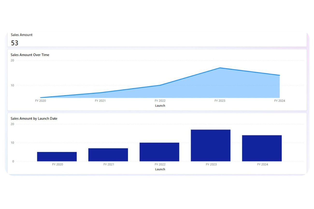
Imagine you have sales data organised by product launch years. Your data might look something like this:
- Launch Year: “FY2020”, “FY2021”, “FY2022”
- Sales Amount: Various values for each year
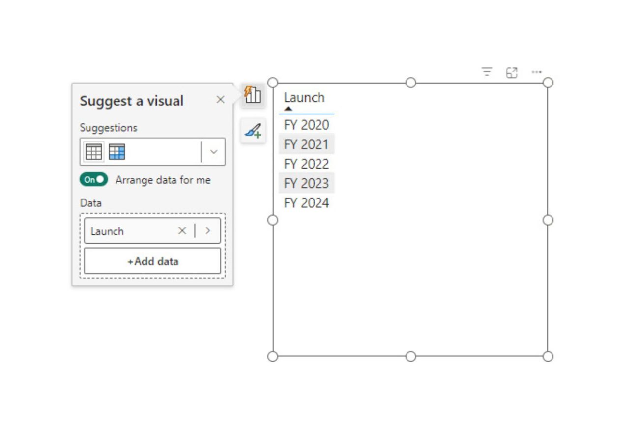
At first glance, everything might seem fine. The data appears in the correct order when you:
- View it in a simple table
- Sort it alphabetically
- Create basic visualisations manually
Where Things Go Wrong
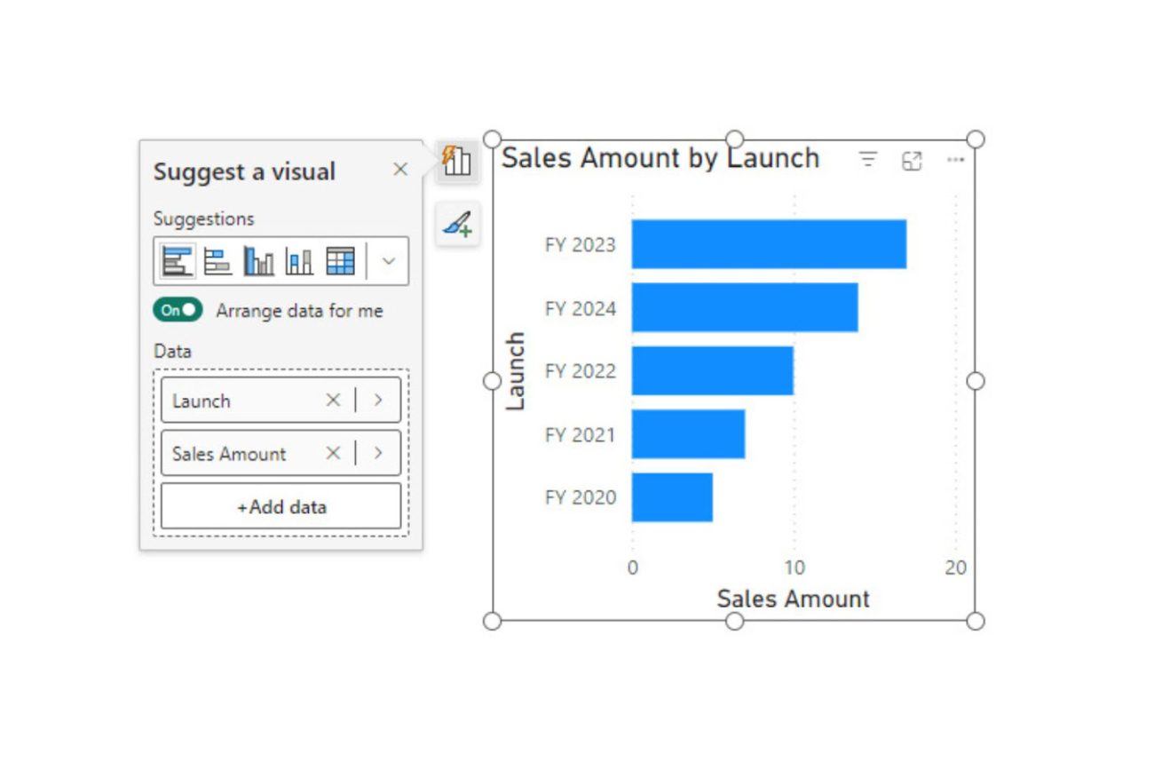
The problem emerges when you start using Power BI Copilot to create visualisations. Here’s what typically happens:
- You ask Copilot to “Show Sales Amount by product launch date”
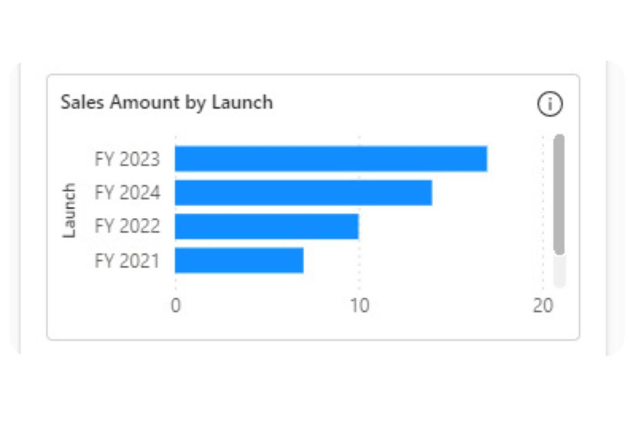
- Instead of ordering by year, Copilot orders the data by Sales Amount
- Your timeline becomes jumbled, making trends harder to spot
- The same issue appears when creating new report pages
Why This Matters
This sorting behaviour can:
- Misrepresent your data trends
- Make reports harder to understand
- Leads to incorrect insights
- Cause confusion for end users
The Simple Solution
Here’s how to fix this issue:
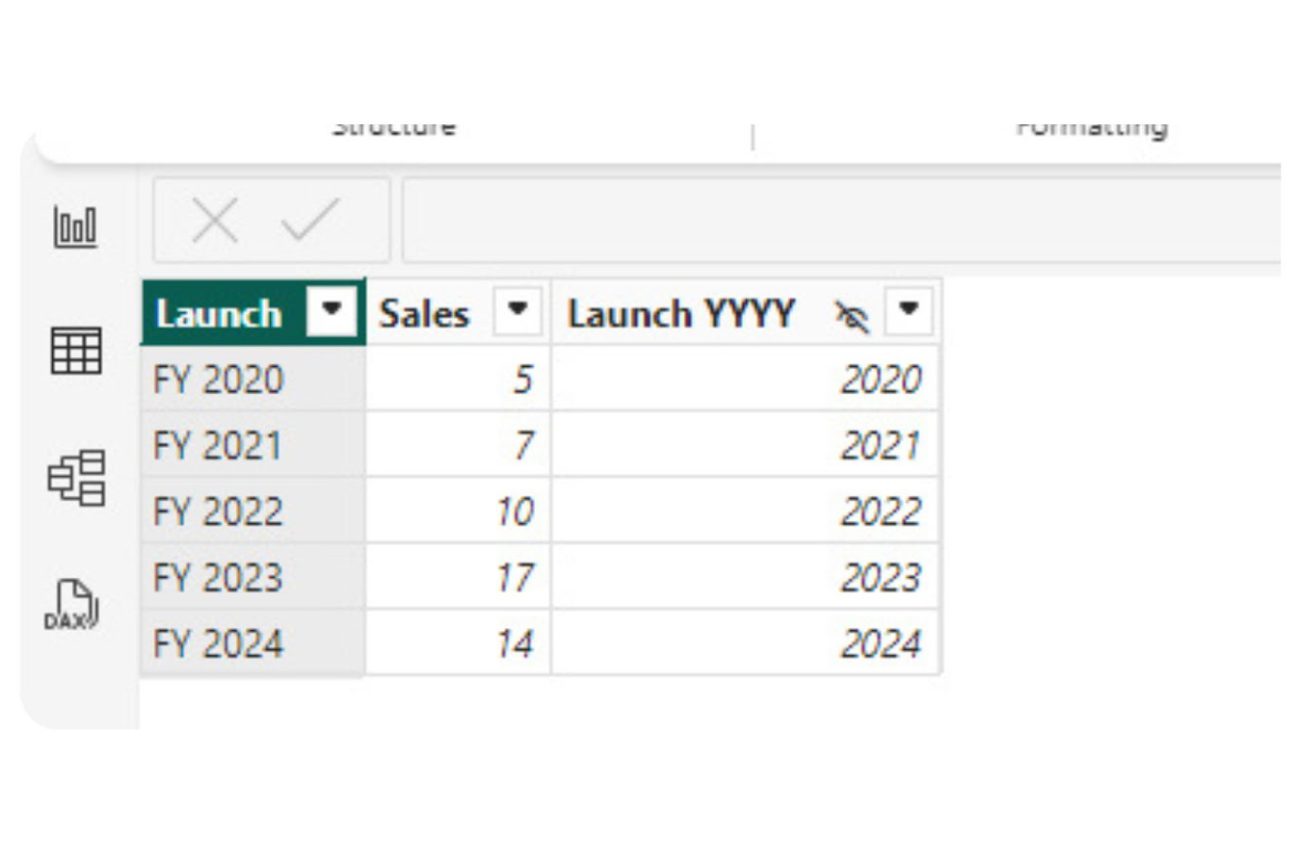
- Create a new column (example name: “Launch YYYY”)
- Use this column to set the “Sort By Column” property for your launch date column
- Hide the sorting column to keep your model clean
Implementation Steps
- Add the Sorting Column
- Create a new column for sorting
- Format it to match your desired sort order
- Keep it simple (like YYYY format for years)
- Set Up the Sort By Column
- Select your display column
- Set its “Sort By Column” property
- Point it to your new sorting column
- Clean Up
- Hide the sorting column
- Test with Copilot
- Verify the sort order
The Results
After implementing this solution:
- Copilot consistently respects your intended sort order
- Visualisations maintain chronological sequence
- Time-based trends become clearer
- Reports become more intuitive
Best Practices
While this solution works, remember to:
- Use proper date dimension tables for more complex scenarios
- Follow standard data modeling practices
- Test Copilot-generated visualisations after making changes
- Document your sorting strategy for team reference
Key Takeaways
- Don’t assume alphabetical sorting is enough
- Set explicit sort orders for time-based data
- Test how Copilot interprets your data
- Think about how end users will consume the information
Next Steps
To improve your Power BI models:
- Review existing models for sorting issues
- Implement proper sort columns where needed
- Test with various Copilot prompts
- Gather user feedback on the results
Conclusion
While setting up proper column sorting might seem like a small detail, it can significantly impact how Copilot generates visualisations. Taking the time to implement proper sorting will lead to better, more intuitive reports that your users can trust.
Getting this right is especially important as AI-powered features like Copilot become more central to business intelligence workflows. A small investment in proper data modelling pays off in more accurate and useful AI-generated insights.
Want to learn more about optimising your Power BI models for AI features? Contact our team of experts for personalised guidance and best practices.